Fix Next button overlapping wallet list in Choose Wallets to Add#6091
Closed
j0ntz wants to merge 2 commits into
Closed
Fix Next button overlapping wallet list in Choose Wallets to Add#6091j0ntz wants to merge 2 commits into
j0ntz wants to merge 2 commits into
Conversation


|
You have reached your Codex usage limits for code reviews. You can see your limits in the Codex usage dashboard. |

Contributor
Author
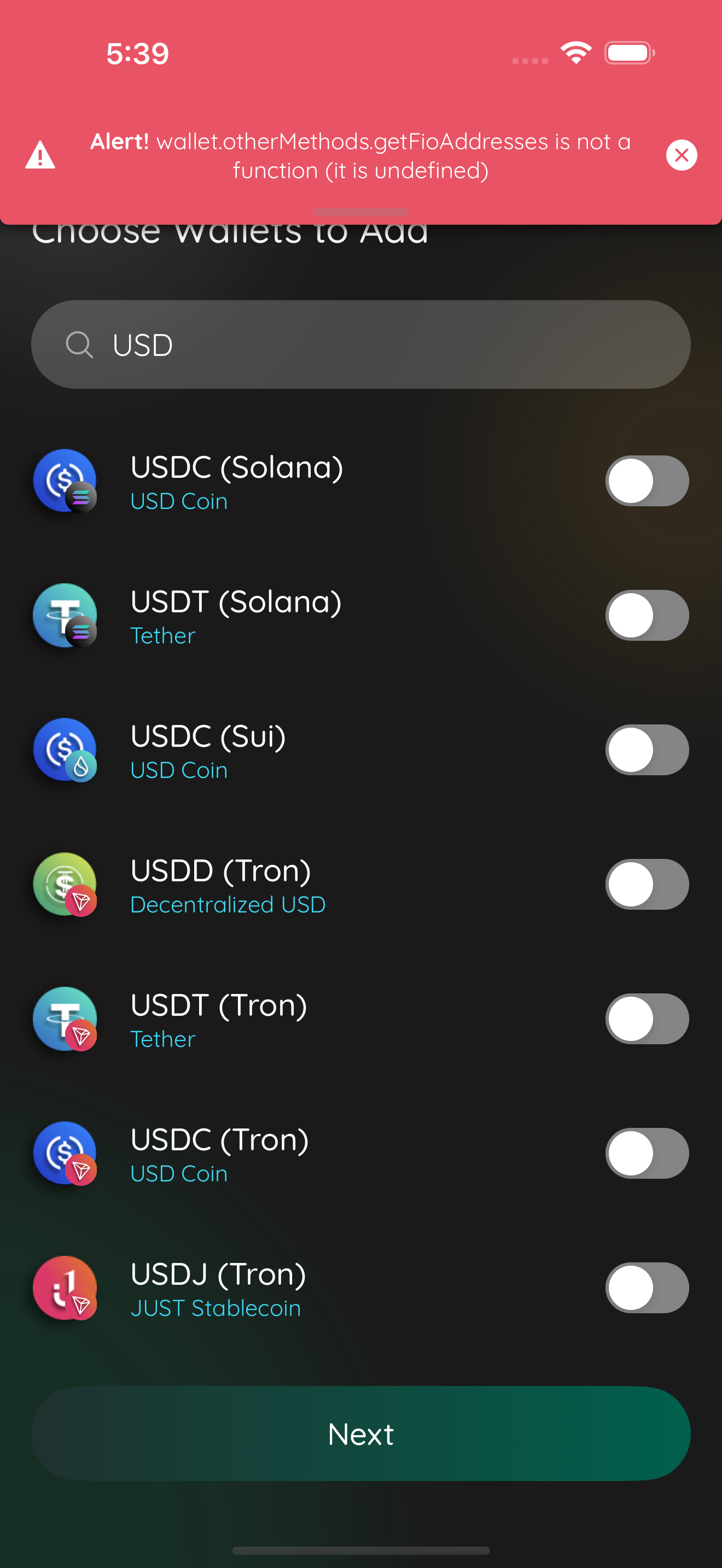
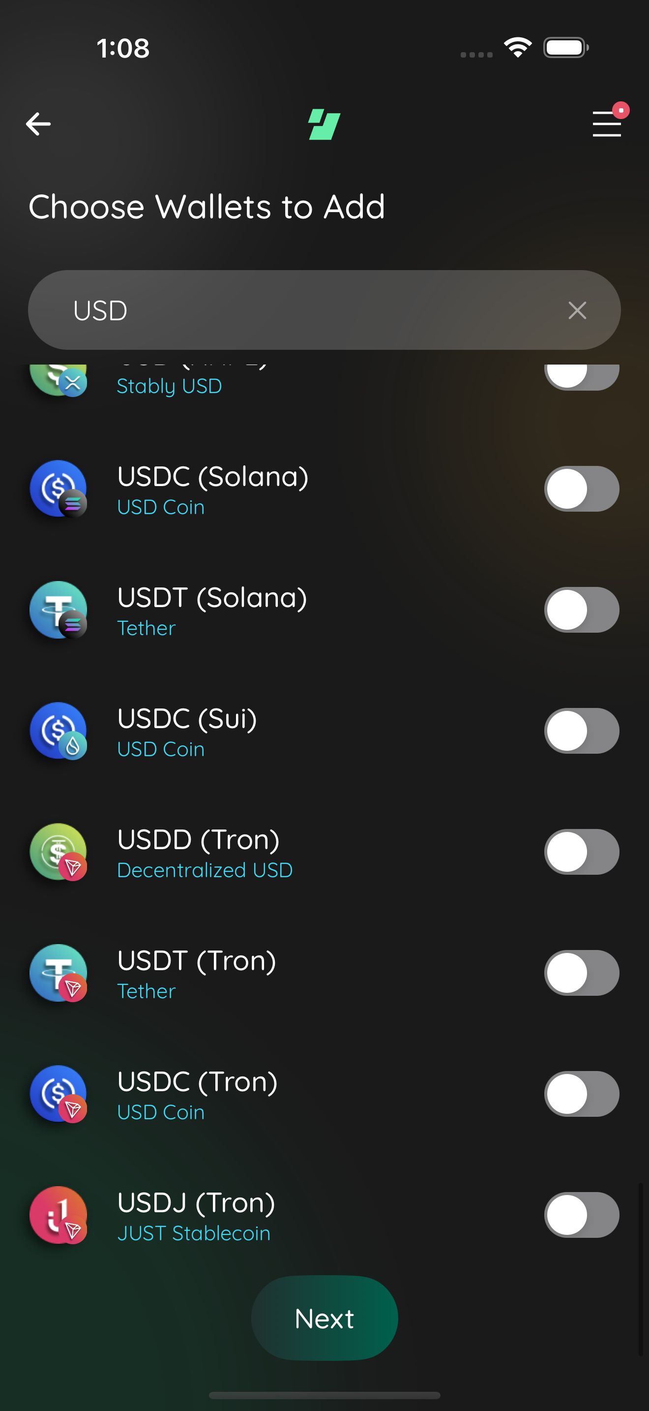
📸 Test evidencelist top fixed
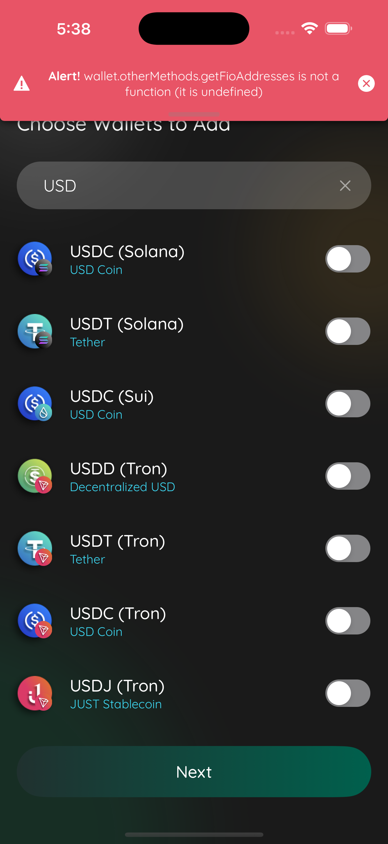
list bottom fixed
Captured by the agent's in-app test run (build-and-test). |
![cursor[bot]](https://avatars.githubusercontent.com/in/1210556?s=60&v=4)

There was a problem hiding this comment.
Cursor Bugbot has reviewed your changes using default effort and found 1 potential issue.
❌ Bugbot Autofix is OFF. To automatically fix reported issues with cloud agents, enable autofix in the Cursor dashboard.
Reviewed by Cursor Bugbot for commit c140312. Configure here.

The Next button on CreateWalletSelectCryptoScene (shared by both the
onboarding and logged-in "+" add-wallet flows) was double-absolutely
positioned: SceneWrapper already renders dockProps.children inside its
own absolutely-positioned, keyboard-aware dock, but the button itself
was also given position:absolute via SceneButtons' absolute prop. That
took the button out of the dock's layout flow, so the dock's measured
height collapsed and the scene under-reserved scroll clearance for it,
letting the button cover the last row(s) when scrolled to the end.

The absolute prop was only forced on outside of Maestro, so automated
UI tests exercised a different, correctly-docked layout and never
caught the regression.

Switch to KavButtons, the same primitive every other scene uses inside
dockProps.children, and drop the now-unneeded manual paddingBottom
compensation since the dock's real height is now measured correctly.

j0ntz
force-pushed
the
jon/create-wallet-button-overlap
branch
from
July 24, 2026 00:57
c140312 to
2d895aa
Compare
Switches from KavButtons (fullWidth) to EdgeButton with layout="solo",
matching the button's original non-full-width appearance and letting
EdgeButton's built-in usePendingPress hook manage the pending/error
state instead of a hand-rolled scene state.
Contributor
Author
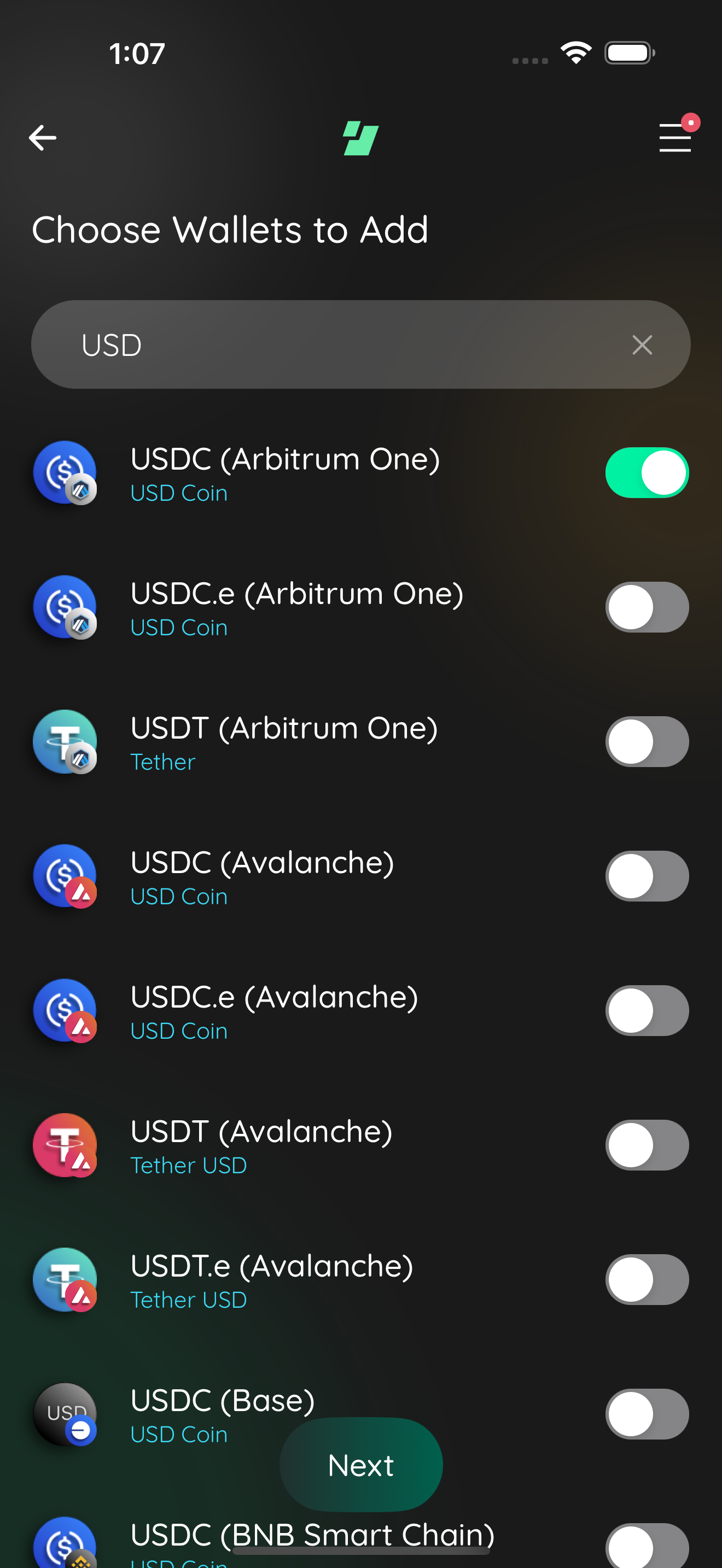
📸 Test evidence (button width fix)button narrow top
button narrow bottom
Captured by the agent's in-app test run (build-and-test). |
6 tasks
Contributor
Author
|
Superseded by #6105, which consolidates this and 11 other small GUI task branches into one PR/branch per the umbrella task's instructions. |
This file contains hidden or bidirectional Unicode text that may be interpreted or compiled differently than what appears below. To review, open the file in an editor that reveals hidden Unicode characters.
Learn more about bidirectional Unicode characters
Sign up for free
to join this conversation on GitHub.
Already have an account?
Sign in to comment
1 participant

Add this suggestion to a batch that can be applied as a single commit.This suggestion is invalid because no changes were made to the code.Suggestions cannot be applied while the pull request is closed.Suggestions cannot be applied while viewing a subset of changes.Only one suggestion per line can be applied in a batch.Add this suggestion to a batch that can be applied as a single commit.Applying suggestions on deleted lines is not supported.You must change the existing code in this line in order to create a valid suggestion.Outdated suggestions cannot be applied.This suggestion has been applied or marked resolved.Suggestions cannot be applied from pending reviews.Suggestions cannot be applied on multi-line comments.Suggestions cannot be applied while the pull request is queued to merge.Suggestion cannot be applied right now. Please check back later.
CHANGELOG
Does this branch warrant an entry to the CHANGELOG?
Dependencies
none
Requirements
If you have made any visual changes to the GUI. Make sure you have:
Description
Fixes the Next button overlapping/hiding the last row(s) of the wallet list on the "Choose Wallets to Add" scene, reported from both the onboarding wallet-selection flow and the logged-in "+" add-wallet flow.
Both entry points already render the same shared component,
CreateWalletSelectCryptoScene, registered under two route names (createWalletSelectCryptoNewAccountfor onboarding,createWalletSelectCryptofor the logged-in "+" button) inMain.tsx. The bug was a double-absolute-positioning defect inside that one component: the Next button was rendered viaSceneButtonswithabsolute={!isMaestro()}while already being a child ofSceneWrapper'sdockProps.children, which itself renders inside its own absolutely-positioned, keyboard-aware dock. Making the button additionallyposition: absolutetook it out of the dock's layout flow, so the dock's measured height collapsed and the scene under-reserved scroll clearance for it, letting the last row(s) end up behind the button when scrolled to the end. TheisMaestro()branch meant Maestro exercised a different, correctly-docked layout than production, so this class of bug was invisible to automated tests.Fix: switch to
KavButtons, the same primitive every other scene in this codebase uses insidedockProps.children(e.g.RampCreateScene,SwapCreateScene,GiftCardPurchaseScene), and drop the now-unneeded manualpaddingBottomcompensation since the dock's real height is now measured correctly.Followup:
KavButtons' primary-only path renders the button atlayout="fullWidth", which stretches it edge to edge. Feedback on the task was that the button should not span the full screen width. Switched toEdgeButtondirectly withlayout="solo"(documented as safe to use standalone), which renders the same narrow, centered pill the scene originally had before this PR, and removedKavButtonsfrom this scene entirely.EdgeButton's ownusePendingPresshook manages the pending/spinner/error state internally whenonPressreturns a promise, so the scene-ownedisNextPendingstate and try/catch/finally wrapper added for the earlier Bugbot finding are no longer needed and were removed.Asana task: https://app.asana.com/0/1215088146871429/1211940991169286
Note
Low Risk
UI-only layout fix on a single shared create-wallet scene; no auth, payments, or data-path changes.
Overview
Fixes the Next button covering the last wallet rows on Choose Wallets to Add (
CreateWalletSelectCryptoScene), used from both onboarding and the logged-in add-wallet flow.The docked footer previously used
SceneButtonswithabsolute={!isMaestro()}insideSceneWrapper’sdockProps, which already lays out an absolutely positioned dock—so the button left normal layout, the dock’s height collapsed, and the list didn’t reserve enough bottom space. The change replaces that with an in-flowEdgeButton(layout="solo") and drops the extraFlatListpaddingBottomcompensation so inset sizing matches the real dock height.Reviewed by Cursor Bugbot for commit 0f3aa75. Bugbot is set up for automated code reviews on this repo. Configure here.